

- Go to Box Apps.
- Select New.
- Name your app. You land on a page with an empty section.
- Name the first section.
- Configure the app by adding blocks to your first section and/or adding more sections.
- When you finish adding sections and blocks, select Done to save your app.
The Done button is inactive if you forget to add parameters to any of the sections or blocks.
Configuring a section
-
Choose how you want to display the blocks in your section:
-
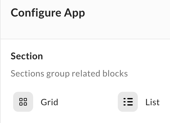
In the Section area under Configure App, select Grid or List.
-
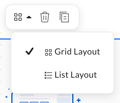
Select a section, then select List Layout or Grid Layout from the toolbar.
The grid view displays blocks in your section next to each other. The list view displays blocks in your section one under another.
-
In the Section area under Configure App, select Grid or List.
-
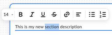
In the Add a description area, enter any text that you want to display, and then format the description by double-selecting the content and choosing from the available options in the contextual menu.
Adding, deleting, and configuring blocks
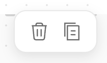
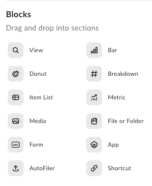
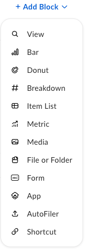
To add a block, drag and drop it to your section from the Blocks area under Configure App, or choose the + Add Blocks drop-down list in a section to add a new block to your app.To delete a block, select it and select the trash icon from the context menu.
- View
- Bar
- Donut
- Breakdown
- Item List
- Metric
- Media
- File or Folder
- Form
- App
- Autofiler
- Shortcut
Required and optional block parameters
There is one required parameter for all blocks: Title/Tile Name. You need to add it to every tile to save your app. Other required parameters differ depending on the block type. Optional parameters are the same for every block type:- Description – select Add Optional Description to display the Description field.
- Theme – choose a color theme. Select Light to choose a color for the block icon. Select Dark to choose a color for the whole block.
- View: Create a View
- Chart: Chart Title
- File or folder: Create a file or folder
- Form: Create a form
- App: Link to an App
- Shortcut: Create a shortcut
- Autofiler: Create an Autofiler
- List: Configure Item List to see preview
- Metric Card: Create a metric card
- Media: Create a media
Block types
Choose the block types you want for your app.View
Choose the Create tab in Create a new View to configure the View block. Add the following parameters:- View Name – name your View
- Metadata Template – choose one of the available templates from the drop-down list
- Select the Duplicate tab in Save Views & Parameters.
- Add a name to your View.
- Select a recent View from the Duplicate settings from drop-down list.
- Select Duplicate to save your View. You can also add the optional description and a theme to the duplicated view block.
Bar
With the Bar block, you can create a bar chart based on the configuration details that you provide. For more information, see Using charts in Box Apps.Donut
With the Donut block, you can create a donut chart based on the configuration details that you provide. For more information, see Using charts in Box Apps.Breakdown
With the Breakdown block, you can create a breakdown chart based on the configuration details that you provide. For more information, see Using charts in Box Apps.Item list
Lists are customizable saved searches based on metadata. Name your list and choose the metadata template you want to use. After creating a list block, you can add filters to it. The filters depend on the metadata template you use. Select the cogwheel icon in the Customize section to set up filters, choose columns you want to display in your list view, and configure display settings. Toggle on or off the options in the Presentation section: Show Item Count, Show Borders, or both. A list block is designed to have feature parity with the View block tooling, but some features are still in development. If you can’t find an option in the List block, select the icon in the top-right corner to open the corresponding View.Metric
Use the metric card block to display a calculated value for a selected metadata attribute. Choose a metric card from the Blocks area when you edit your app. To configure a metric card:- Create and link a view that defines the dataset for the calculation. Filters on the linked view apply to the metric calculation. A view created from a metric card can’t be renamed or edited from the view page directly (same behavior as a chart block).
- Choose a metadata template, then choose one integer or decimal metadata field. Other field types aren’t available.
-
Choose a calculation type:
- Item count — number of items where the selected metadata value isn’t empty
- Sum — total of all values
- Average — average of all values
- Maximum — highest value
- Minimum — lowest value
- Choose a metric format: Number, USD, JPY, CAD, EUR, or GBP. You can also set a custom format with a prefix (up to 4 characters) and suffix (up to 12 characters). Set the number of decimals from 0 (default) to 2.
-
Optionally turn on:
- Abbreviate large numbers — for example, 44K or 22.34M
- Allow users to open underlying View
Media
Use the Media block to embed Box-stored media on an app page. Supported file types include images, videos, audio files, Box Notes, and PDFs. Media renders inline in the block, so you don’t open a separate preview. To configure a Media block:- Choose a supported file from Box.
- Set the block size. The default size is 3×2 in an 8-column layout. The minimum size is 2×2.
- Configure the title:
- Use Item Name for Block Title — enabled by default. When enabled, the title uses the selected file name. When disabled, you must enter a title.
- Show block title — enabled by default. When disabled, the title is hidden on the Media block.
File or folder
When you add a file or folder block, you need to specify a root folder where app users add new content. Select Select Content under Choose from Box. In the next window, a standard search field and your Files view display. Select a folder, then select Choose to go back to block configuration.When you add a name, it changes the folder name in the block. The original folder name in your Files is not changed.
Form
In a form block, you need to provide a Box Form to use and decide how you want to present it. Select the search field under Choose a Box Form, or start typing the name of the form to get a suggestion. The Presentation parameter has two options: Overlay / Pop-Up and Open in New Tab.App
The app tile links to another app you or another Box Apps Admin created. Select the Select an App field under Choose from Box to display the available apps.Autofiler
Add metadata to files or folders while they are uploading. You can add metadata in the Current File tab. Select the desired Metadata Template from the drop-down list.Shortcut
Add a link in the Enter a URL field.Adding pages
You can add multiple pages when you’re creating or editing your apps. To add more pages:- Select New App or navigate to an existing app and select Edit.
- Select Add Page under the app name.
- Name your new page. The name has to be unique and no more than 50 characters long.
- Duplicate — duplicate page name is original page name(1)
- Rename
- Move Left
- Move Right
- Delete
By default, your app has one page and only the first two options from the More Options menu are available.
Sharing a page
You can share specific pages from your app. To do so:- Share your app like any other Box product.
- After you invite a collaborator, open the More Options menu in your app.
- Choose the Manage Collaborators option.
- Select the correct access level in the Permission column.
- Choose the pages you want to share with the collaborator in the Added To column — only available for the Viewer role.
If a collaborator with the Viewer access removes themself from a page, they lose access to the whole app.